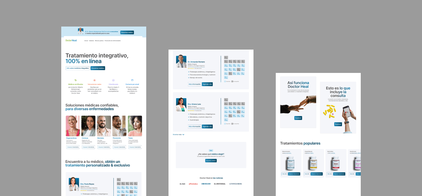
Doctor Heal Online
Platform that offers online medical appointments.
Proyecto
Doctor Heal was created as a personal brand in 2020 during the Covid-19 pandemic, and grew exponentially to become a six-figure annual revenue company.
The mission was to design UX/UI solutions that supported the company’s growth.
My role
UX/UI Designer
Tools
- Figma
- Trello
- WordPress
- AnyDesk
- Clarity.
- Overview
The brand’s main representative is a doctor with a consistently full schedule. Although other physicians were available, users lacked the trust to book appointments with them.
- Problema
- Lack of public awareness of the other doctors.
- Use of Calendly for appointment scheduling, which hinders conversions due to the number of steps users must follow
- Objetivos, KPIs
- Removal of the doctor’s image from the brand.
- Inclusion of the other doctors’ faces.
- Reduction of the steps required to book an appointment.
- 5% increase in conversions.
- Resultados
- Successful implementation of a user experience that improved user satisfaction by 30%.
- Increase in conversions from 290 to 900 booked appointments, resulting in a revenue gain of USD 100,000 (210.34%)
Project timeframe
El proyecto se realizó en las siguientes etapas:
➜ Análisis del diseño de experiencia existente.
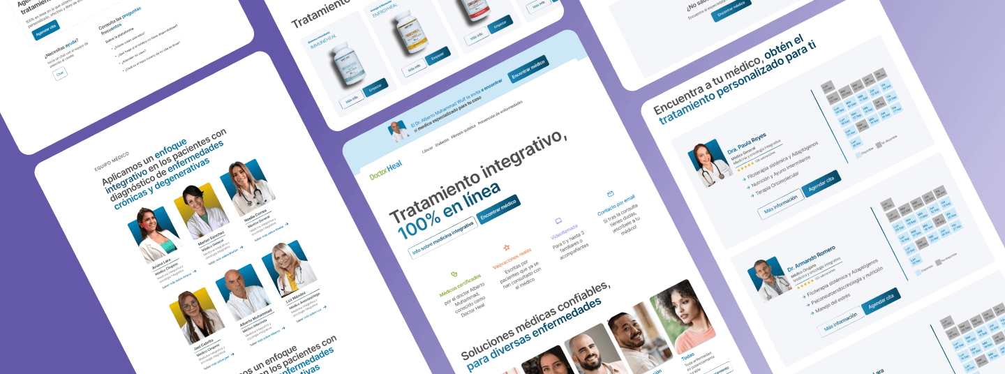
➜ Research: estudio de méticas y estadísticas, creación de un user persona, etc.
➜ Deconstrucción del diseño de experiencia existente.
➜ Construcción de un nuevo diseño de experiencia.
➜ Prototipado.
➜ Implementación & Desarrollo en WordPress (Elementor).
➜ Testing.
➜ Mejoras.
UX Research
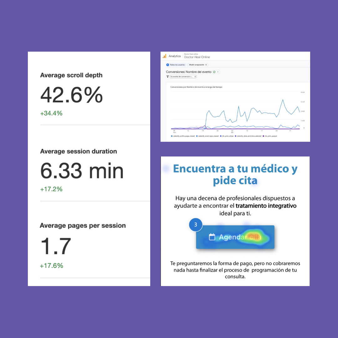
- Eye tracking.
- A/B Testing.
- Pruebas de Usabilidad.
- Análisis de datos: Google Analitys.
Analysis of the existing experience
La deconstrucción del diseño de la interfaz y experiencia de usuario existente, fue seguida de la creación de un nuevo diseño
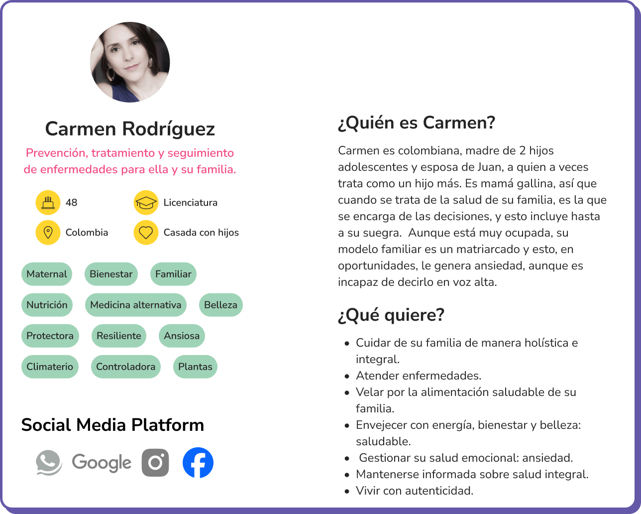
Designed Screens
Schedule Medical Appointment
Help Center
Doctors Overview Page
Doctor Profile Page
Contact
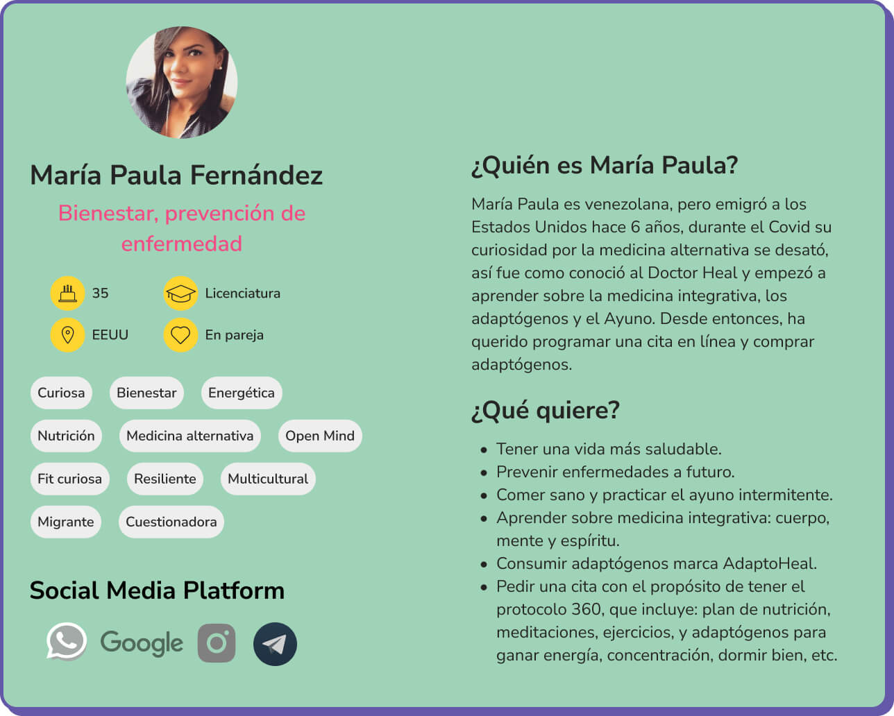
Let’s get to know the users
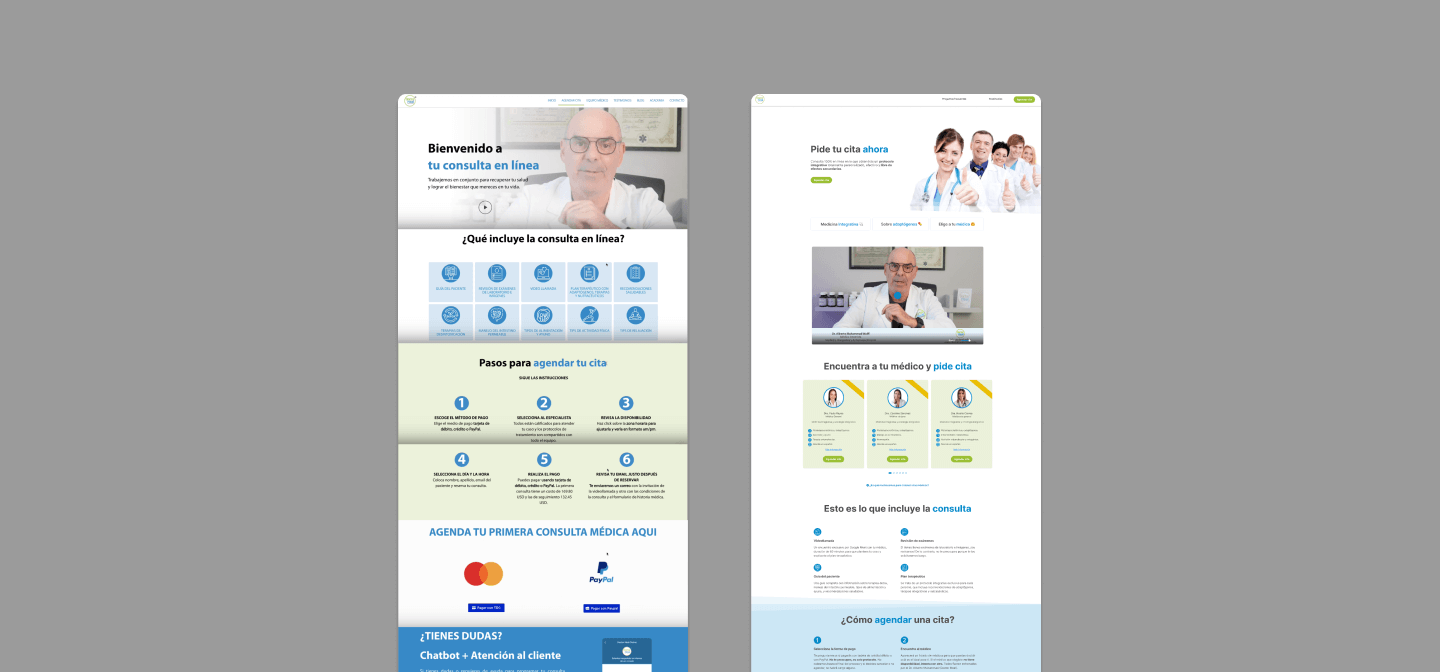
Appointment Booking Page: Before vs. After
After deconstructing the existing interface and user experience, I moved on to creating a new design.
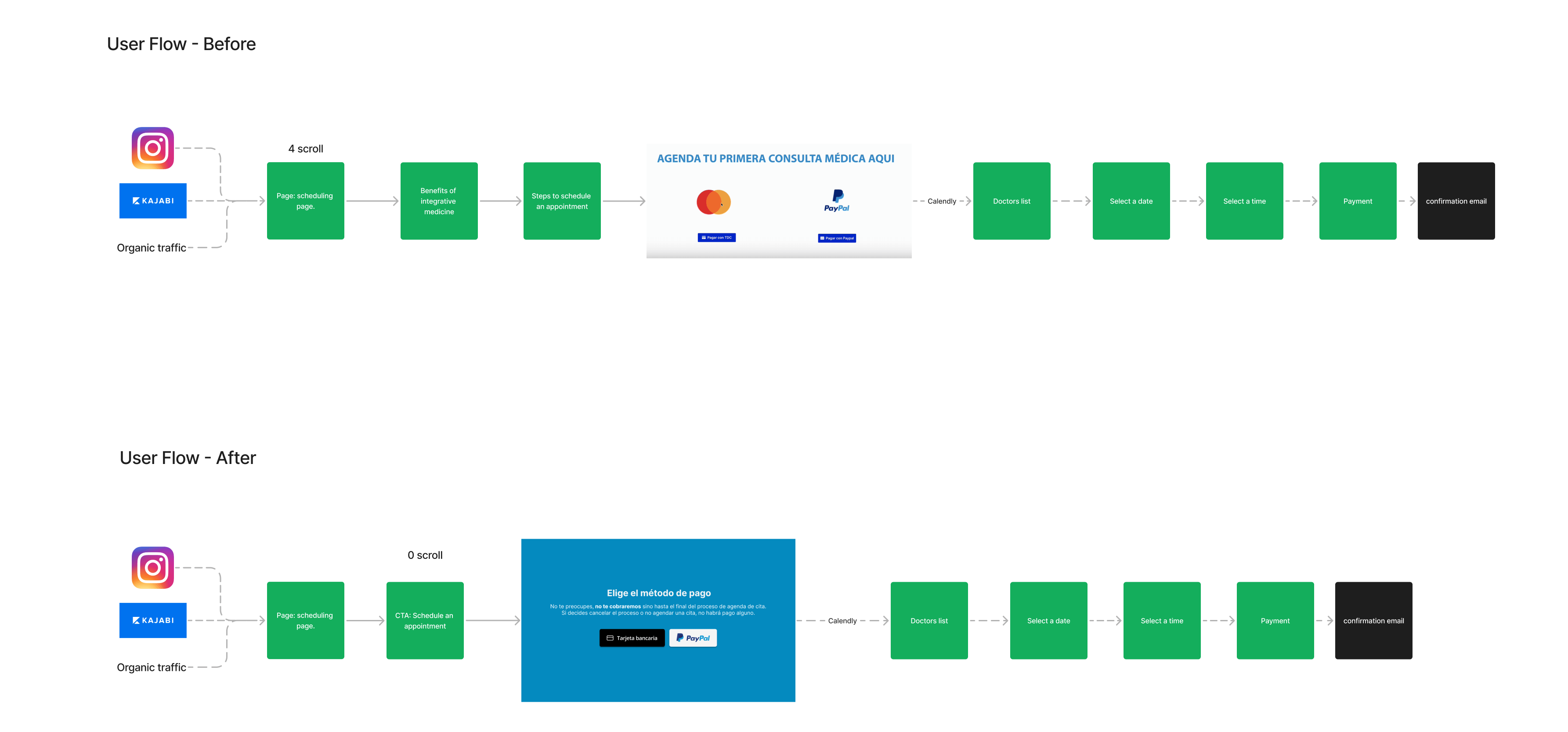
User flow of the appointment booking page
At the request of the client and the Business team, it was necessary to maintain the appointment booking process through Calendly, with two payment options: PayPal and Credit Card. Instead of asking users to choose a payment method before even seeing the doctor’s availability, we implemented a solution that explained the procedure in a brief message.
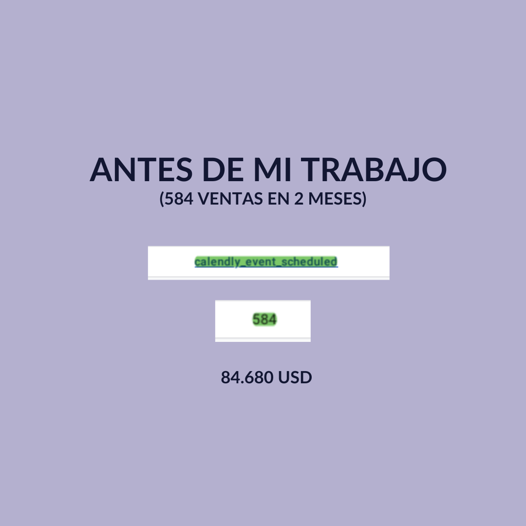
Conversions
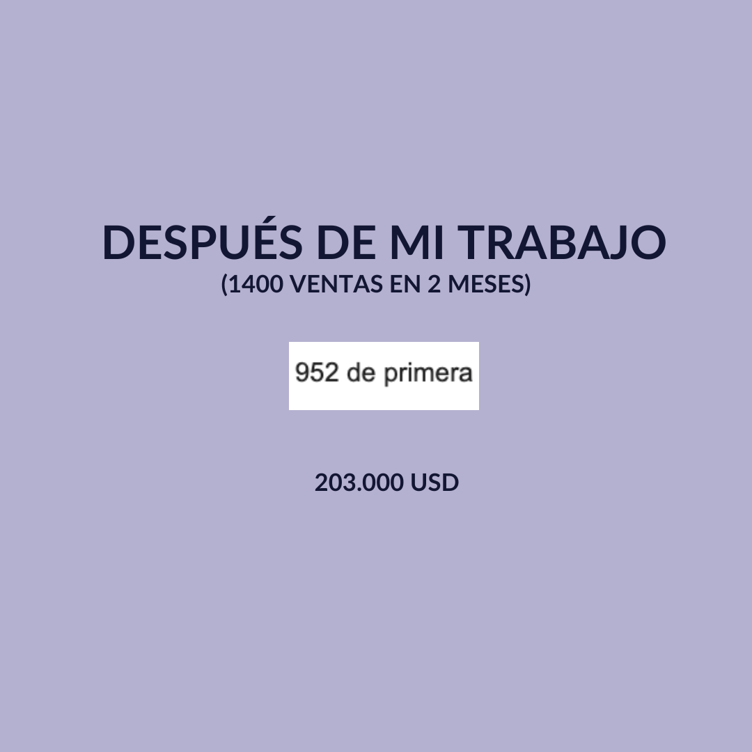
Following the initial website redesign, which introduced clear microcopy for CTAs, explicit pop-up messages addressing the challenges of booking appointments via Calendly, and dedicated profile cards for each medical professional, conversions increased by 200%.
Whats next?
Moving forward, the UX/UI design will be further refined to better align with user preferences, informed by data analysis, heatmaps, satisfaction metrics such as Net Promoter Score (NPS), and survey feedback.
The proposal also recommends adjustments to brand colors to improve accessibility for users with visual impairments.
Finally, the ability to check doctors’ availability directly on the website will be introduced, significantly streamlining the booking process